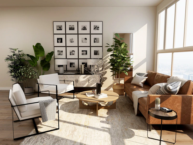
Furniture color is personal. The right shade depends on the piece, the light in the room, the finish underneath, and whether you want the furniture to settle quietly into the background or become the detail everyone notices.
This collection brings together the broad ideas that emerged from a creative conversation about furniture makeovers. Across many different styles, the advice returned to a few dependable principles: preserve beautiful wood when you can, use neutrals when flexibility matters, and choose color when it adds energy to the room.
A considered furniture palette
Brightens a small piece while keeping the finish soft rather than stark.
Adds definition to a dresser, console, or cabinet without the weight of pure black.
A muted botanical note that works naturally with wood, linen, and brass.
Brings color to a room while remaining gentle enough for everyday furniture.
Lets grain and age remain part of the story, especially on solid wood.
A confident accent for a piece that needs presence and contrast.
What the ideas have in common
Neutrals make furniture adaptable. White, cream, soft grey, and warm taupe can move between rooms easily. They are especially useful when a piece is likely to be rearranged or when a small room needs visual breathing space.
Wood does not always need covering. A lightly sanded surface, a simple stain, or a protective finish can be the most beautiful choice. Existing marks and grain often give a piece more character than a completely uniform coat.
Color works best when it has a role. A blue dresser, green side table, or dark cabinet can anchor a room. If the rest of the space is restrained, one painted piece can provide enough personality without making the room feel busy.

Before opening the paint tin
Study the undertones
Two greys can behave very differently: one may lean blue, another brown or green. Place samples beside the walls, floor, and upholstery that will remain in the room.
Test the finish in daylight
Paint a small hidden area or a sample board and view it morning, afternoon, and evening. A color that feels balanced in the store may become much stronger under direct light.
Keep the original character
Before painting, check whether the surface has attractive grain, joinery, or patina worth preserving. A combination of stained wood and painted sections can offer the best of both worlds.
Choose hardware as part of the palette
Existing pulls and knobs may become a useful contrast. Brass, aged metal, black, and simple wood each change the mood of the same paint color.